Want to upgrade your home at no cost? Yes, it is possible! These interior design tricks will give you an elegant home without the spend
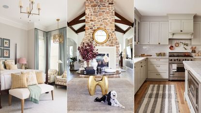
(Image credit: Future / Alice Lane Interiors / Becca Interiors)Jump to category:
If you’ve been wondering ‘how can I make my home look better without buying anything?’ You are not alone in your desire to curb spending.
It is so easy to get caught up in a rapid cycle of consumerism. Before you know it, your quest to live a more intentional and sustainable life is drowned out by yet even more stuff. So with this in mind, I decided to embark on the ‘100 day no-buy’ challenge: exactly 100 days dedicated to cutting out extraneous purchases in order to reset my spending habits.
Remember, room transformations don’t always have to be grand or expensive affairs. Instead, they can be slowly curated through minimal – and free – updates using items that you may already own. All your home needs are a few thoughtful details to give it that five-star status that you have always desired.
Sponsored LinksIf you own a mouse, you will never turn off your computer again.BaseAttackForce
In this article, we’ll explore the benefits of the ‘100 day no-buy’ challenge, and clever tricks you can use to improve your home throughout. Each one is easy but impactful – and above all, beautiful. So, if you have time on your hands and are in need of inspiration, keep scrolling…
RECOMMENDED VIDEOS FOR YOU…1 second of 30 secondsVolume 0% PLAY SOUNDHow Can I Make My Home Look Better Without Buying Anything?
Before you invest in designer décor, think critically, because spending a small fortune on furniture and furnishings does not always guarantee a bold, beautiful, and bodacious look.
Here, some of our favorite interior designers offer their simple home decor ideas, advice, and expertise on making a home look better withing buying anything. It is easier than you think.
1. CURATE A TALKING POINT WITH OBJECTS YOU ALREADY OWN
(Image credit: Alice Lane Interior Design / Nicole Hill Gerulat)
The way art is displayed can have a transformative impact on a space, and chances are, like me, you also have a plethora of pretty trinkets and objects that you’ve stowed away.
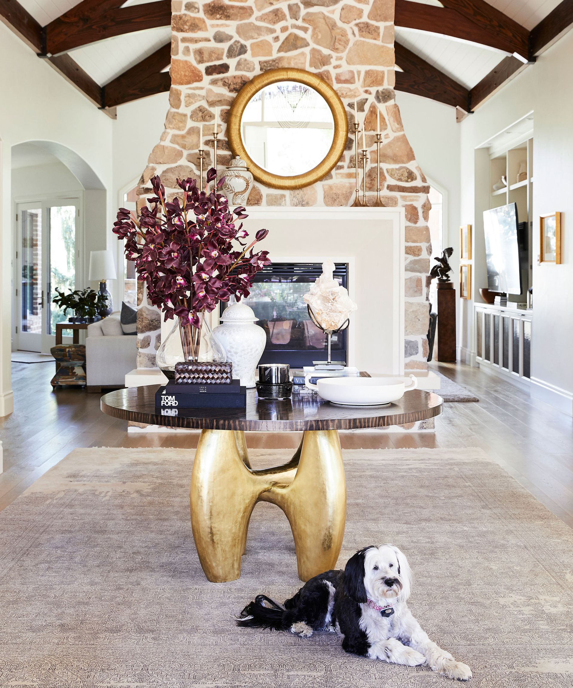
An eye-catching table display makes a conversational starter for guests, and it is one of the focal points in my home. After inheriting it from my parents, it is also my most treasured piece of furniture, and I imagine it will be a key piece in every home I live in.
I spoke to interior designer Jessica Bennett(opens in new tab), founder of Alice Lane Interiors who also shares my passion for using tables to display art. ‘Here, my client has a generously-sized round table that I knew I couldn’t leave bare, so I turned it from drab to decorative using items already in their possession.
‘It now doubles up as an inspirational work table and somewhere to display my finished pieces – an ideal option for anyone wanting to arrange art anywhere other than on a wall,’ she says. ‘The key to making a successful arrangement is to mix height and scale, she adds.’
Camilla Clarke, co-founder and creative director of Albion Nord(opens in new tab) agrees: ‘We love the combination and balance of using antique, found, and contemporary objects together to create a sense of evolution in a space.’
2. USE LEFTOVER PAINT CANS TO ADD COLOR TO TRIMS
(Image credit: Naked Kitchens)
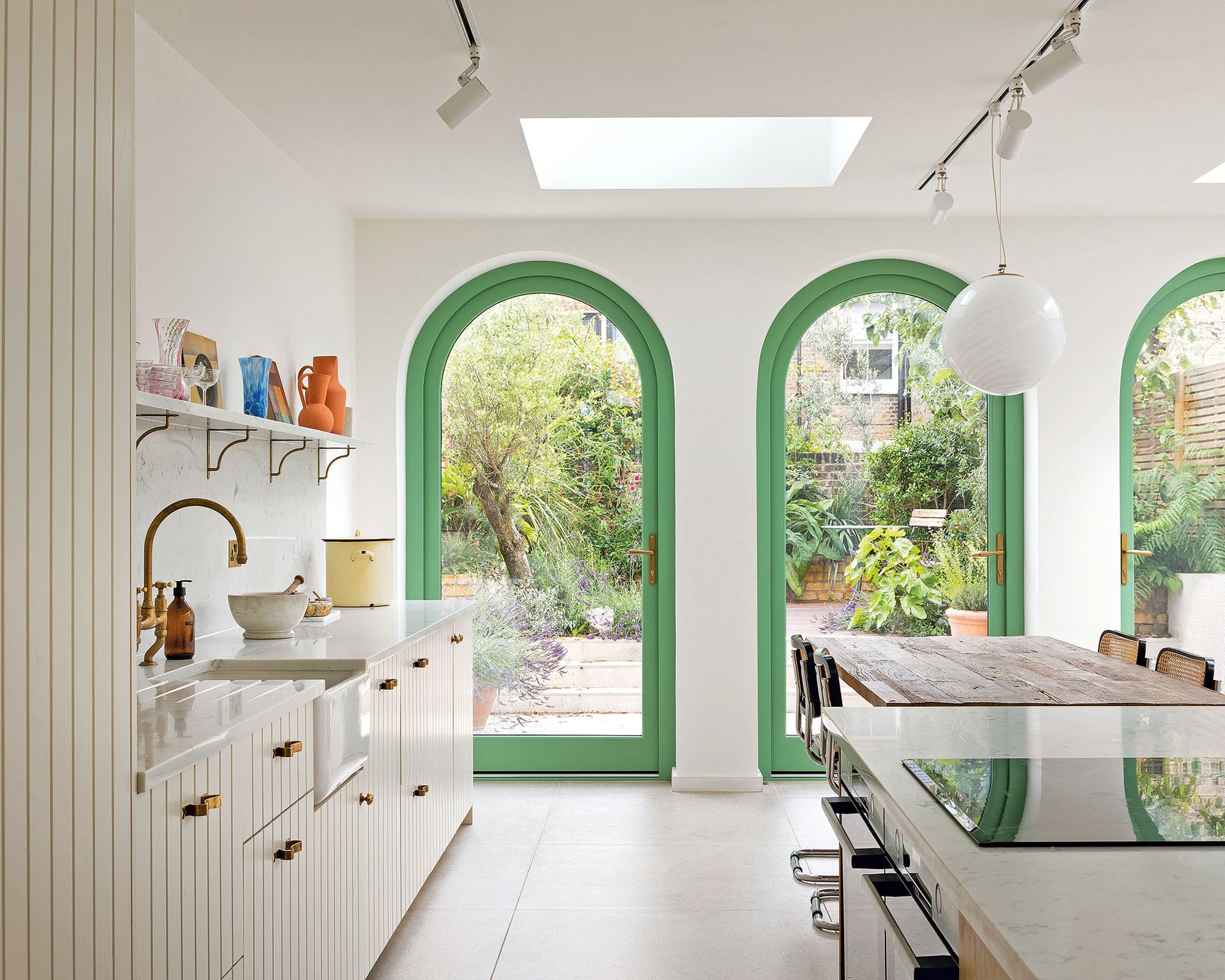
Creative paint ideas and paint tricks can bring a unique beauty to a home, and the more creative they are, the better. If you have leftover paint cans, perhaps from previous DIY projects, you can use these to give areas of your home a welcome color refresh.
Kit Kemp is highly regarded for her use of color, showcased in the various Firmdale hotels she designs. If you’re unsure about where to begin with color in the home, Kit has plenty of ideas and recommends a door frame as one of the easiest places you can start.
‘It’s the perfect canvas for applying a fun addition of color or even just a soft complementing hue to the rest of the room,’ she explains. ‘Door frames are the borders between one room and the next, from a cozy drawing room to a bright kitchen, so why not have something that frames the room beyond and is a fun and colorful addition in itself?’
In this energetic space, designed by Naked Kitchens, decorators painted the window frames in a contrasting green hue for a welcome shock of color: one that mimics the glorious green palette outside.
3. REARRANGE BEDROOM FURNITURE TO AID SLEEP
(Image credit: Tim D Coy Photography / Margaret Ash Design & Home)
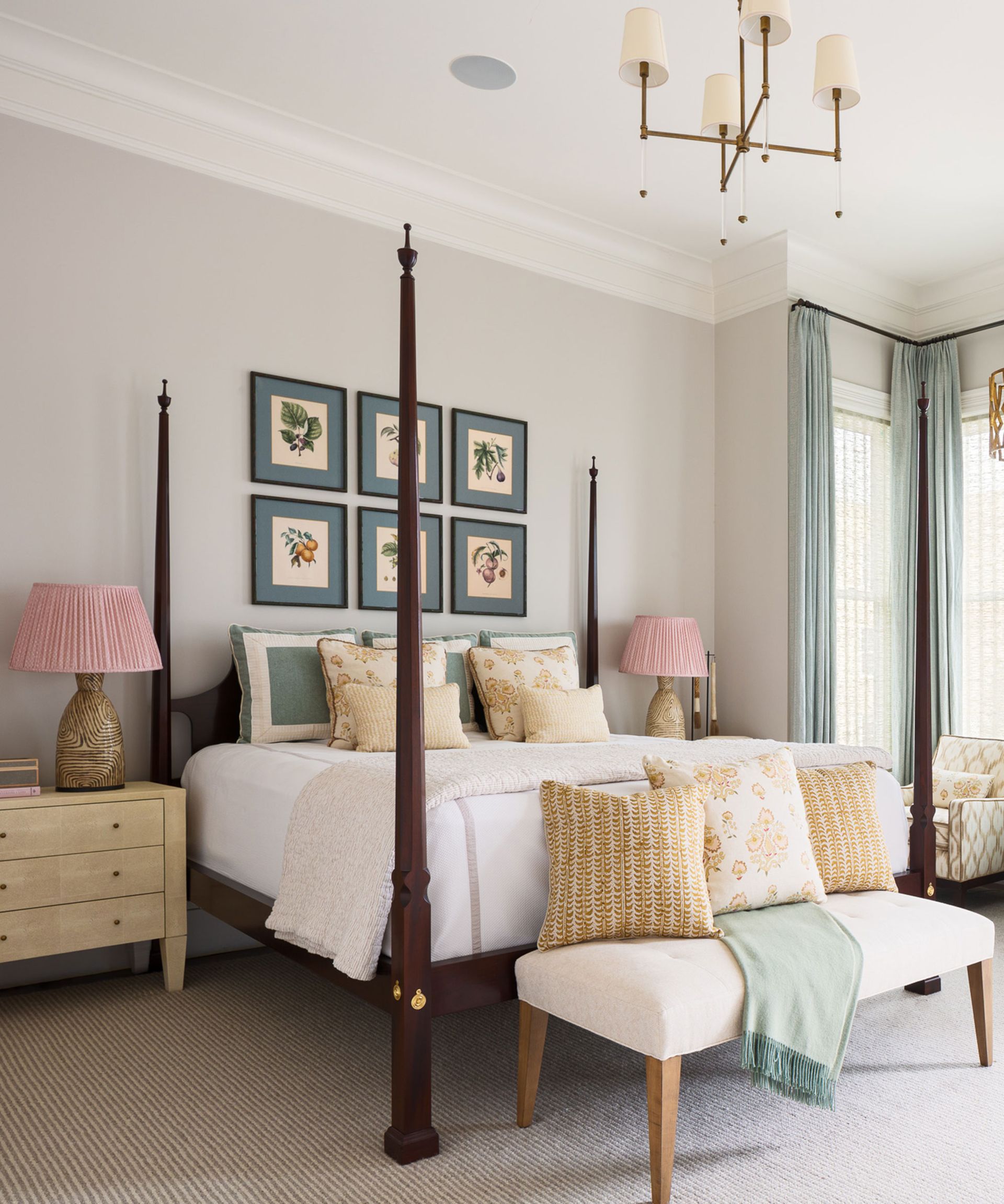
Being able to sleep soundly is an issue we all want to solve, but doing so could be as simple as rethinking your bedroom layout and Feng Shui furniture placement. Without the distraction of a shiny new purchase, I was able to spend my time readjusting the layout according to bedroom Feng Shui, and not only am I sleeping better, but I feel like I have a brand-new space.
When it comes to the placement of furniture in a bedroom, a lot will clearly depend on the size and orientation of the room. Feng Shui experts recommend ensuring the bed is located in what is known as the ‘command’ position – that is, so that you can see the entrance of a room, looking towards the door but not being directly opposite. Nor should it be positioned under a window (too drafty), or against the party wall (in case sounds from next door interrupt sleep).
4. TAKE THE RULE OF THREE TO YOUR HOUSEPLANTS
(Image credit: Future PLC)
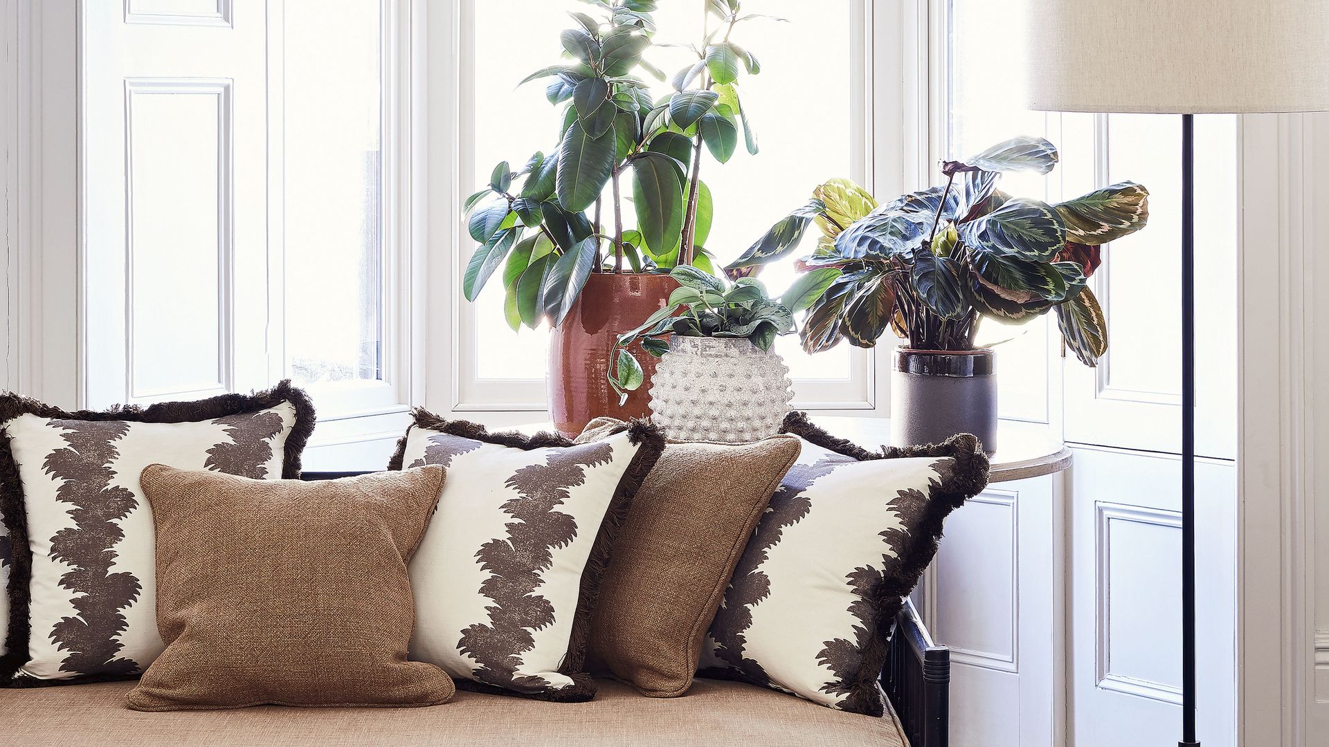
It is common knowledge that fresh flowers or a houseplant can also inject some life into an otherwise simple space, but I wanted to curate a unique freshness to my current foliage by using the rule of three – an interior design device that experts use to ensure that the spaces are visually pleasing.
‘To make an impact with a decorative display, the magic number is definitely three,’ says Lucy Searle, editor-in-chief of Homes & Gardens. ‘Grouping three objects is a technique the world’s best interior designers employ frequently to make the items they collect together a feature worth attention. It is a simple technique that I use in my own home to great effect.’
While many designers often use this on a grander scale, to add impact with lighting, furniture, and color schemes, it also works with cushions, artwork, and yes, even houseplants. It’s a strategy that makes the space less formal than one where symmetry is to the fore.
Here, the pyramidal arrangement leads the eye around the group of three – and it’s a shape that’s frequently employed by designers exploiting the power of three.
5. SWAP RUGS FROM ROOM TO ROOM
(Image credit: Rikki Snyder)
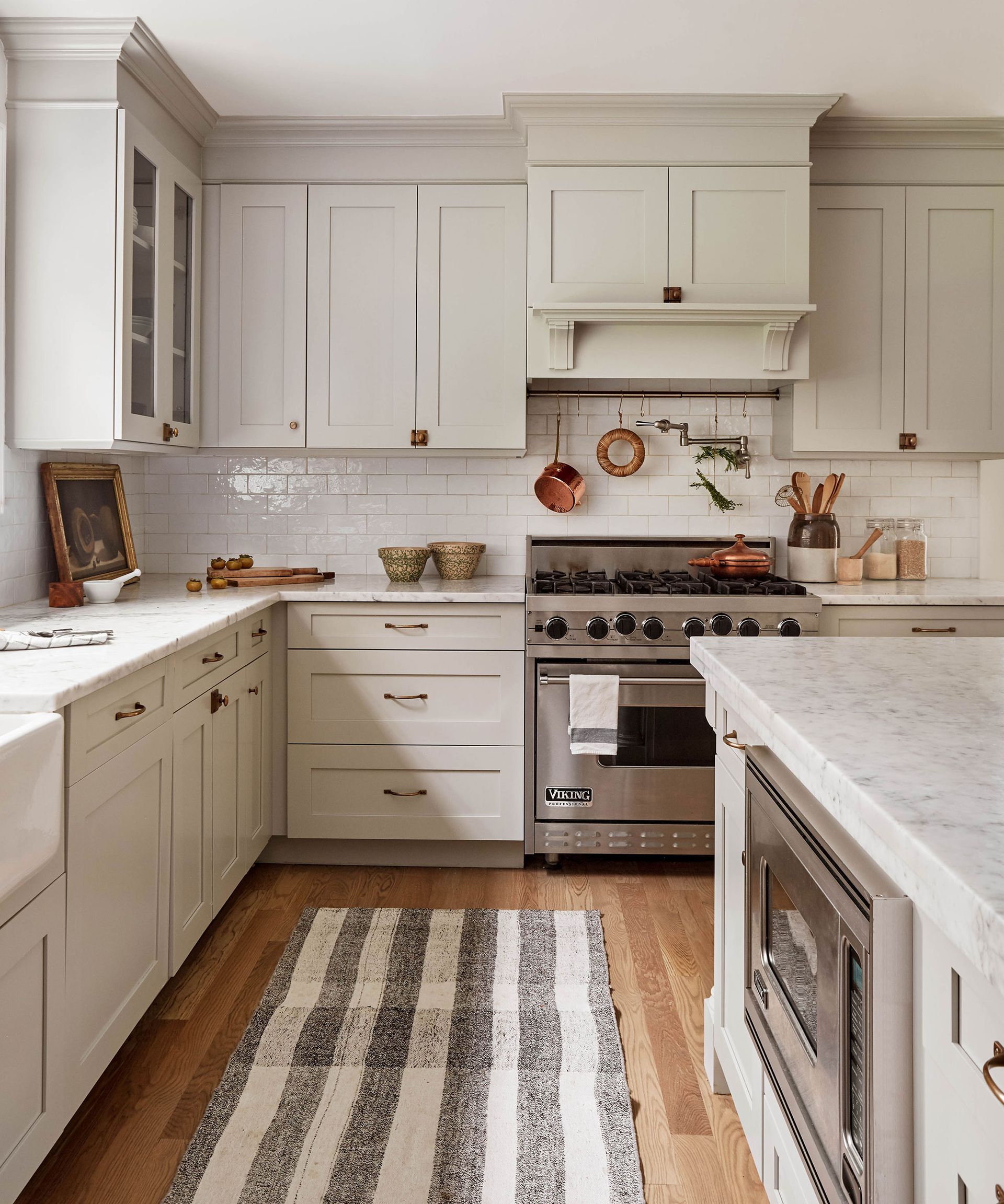
Rugs establish a focal point in a room and bring a level of coziness that floorboards – which I love for their aesthetic – often lack. However, like with most things, I do tire of seeing the same rug in any one room for too long. The solution? I love to regularly swap rugs from room to room, and the results are too incredible not to share.
‘If you have a whole house color scheme, this is a wonderful way to add new life to each room,’ agrees says designer Louise Grey, of House of Grey(opens in new tab). ‘You can also change the room by the way you style a rug, and I love to play around with this: either you place your furniture on top of it, or you place it around it, so the furniture frames the rug. They are two very different looks.’
Another free styling trick to consider is hanging a rug on the wall: it acts as a great piece of art, fills a big space and, just like on the floor, acts as an extra layer of insulation for sound and heat – making the room cozier. Rugs can be an expensive purchase, so this simple trick is a must for adding depth and dimension.
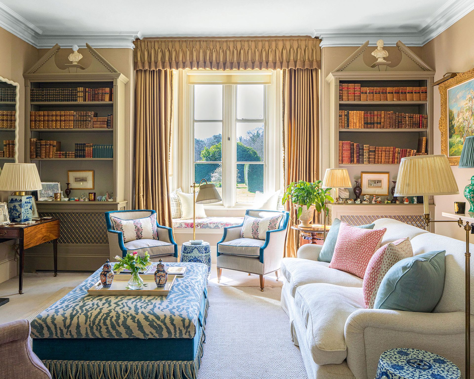
6. CREATE CONVERSATIONAL SEATING
(Image credit: Kelling Designs)
Back in the 19th century, the French invented the ‘gossip’ or ‘conversation chair’. Essentially an S-shaped seat that sat centrally in a room, and where two people could sit side-by-side and face-to-face and swap news, it was considered the height of sophistication, and was de rigueur in living spaces for decades.
Over time, its popularity waned with the advent of TVs and media rooms, however, interior designers are reporting that more and more of their clients are asking for ‘conversational seating’ once again. Rejoice!
‘When you have people over for gatherings, you notice when you’ve got the seating arrangements right, says renowned interior designer, Nina Campbell(opens in new tab). ‘Seating plans are very important – and not just at a dinner table. I like to think of seating plans for the living room – what I call conversational seating.’
‘I find that two people sitting side by side do not always speak to each other, so having an occasional chair pulled in at a diagonal can create conversational triangles. ‘I like a room to have a central focal point, such as a fireplace, and then I arrange the living room seating so that groups of three can sit and talk,’ says Nina.


